About our brand
The Long Covid Support Aotearoa (LCSA) Facebook group was created at the beginning of the Covid-19 pandemic in 2020, when many individuals who contracted the virus in the first wave were not recovering. As the scale and impact of Long Covid became apparent, a grassroots movement of advocates emerged, sharing their experiences, and calling for more research, recognition, and support for the one in ten people affected. Three years later, in 2023, this movement has significantly expanded, with some of its international members based in New Zealand. Together, they launched the LCSA website which is written “by patients, for patients”.
The logo rationale
We employed brand designer Lotte Hawley to develop the website’s brand and were lucky with how much consideration she put into this project.
Lotte’s exceptional attention to detail is first evidenced in the striking heart-shaped logo. She was inspired by anatomical and physiological elements and systems in the body as well as the natural world. The strong and balanced lines depict movement, grace, trust, and strength through its structure. The use of Māori patterns gives it a distinctive Aotearoa look and feel. The logo tells the story of Whanau and spirit and offers love and support.
The logo comprises four interlinked chains, with repetitive line work illustrating the day-to-day repetition and slog of Long Covid symptoms. It alludes to the flow of currents, tides, rivers, and oceans that surround us, reminding us that just like in nature, nothing blooms all year long. The circular form symbolises the lifelong work required to fix and mend the body and spirit. Our brand designer, Lotte Hawley, says “This aesthetic steers away from typical medical design and creates a neutral and inviting platform for any New Zealander to engage with”.
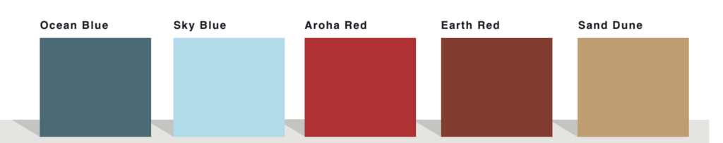
The colour palette
The colour palette chosen for the logo inspires feelings of trust and change while incorporating the natural undertones of the earth and Māori culture. The sandy colour, resembling a sunrise or sunset, symbolises the beginning or ending of a task. The red and blue colours represent oxygenated and deoxygenated blood, circulating throughout the logo. It was important for the colours to feel medical in nature but not be sterile and uninviting.
The website offers much-needed support to those affected by Long Covid and raises awareness of the condition globally. We hope you can sense the considerable amount of thought and effort that has been put into creating the logo and colour palette.